
If Girls & Cows Could Sail Together
If Girls & Cows Could Sail Together
Odette England’s, “Dairy Character”: Part Two

‘Bad art makes you go - Wow! ....huh? Good art makes you go - Huh? ...Wow!’ Ed Ruscha
When thinking about photobooks I eventually turn to form. What is the physical shape and substance of the thing? Because, to its everlasting credit, a book, a real honest-to-God, hold it in your hand, prop up the short leg on your table, throw it at your mice, bound book is finally, at the end of the day (as we each are too of course) an object, loose in the universe glued by gravity to this rifling orb circling the sun. As objects we share the scene and experience the all and the just this together. The touch and feel of that is no small matter. We are kith and kin.
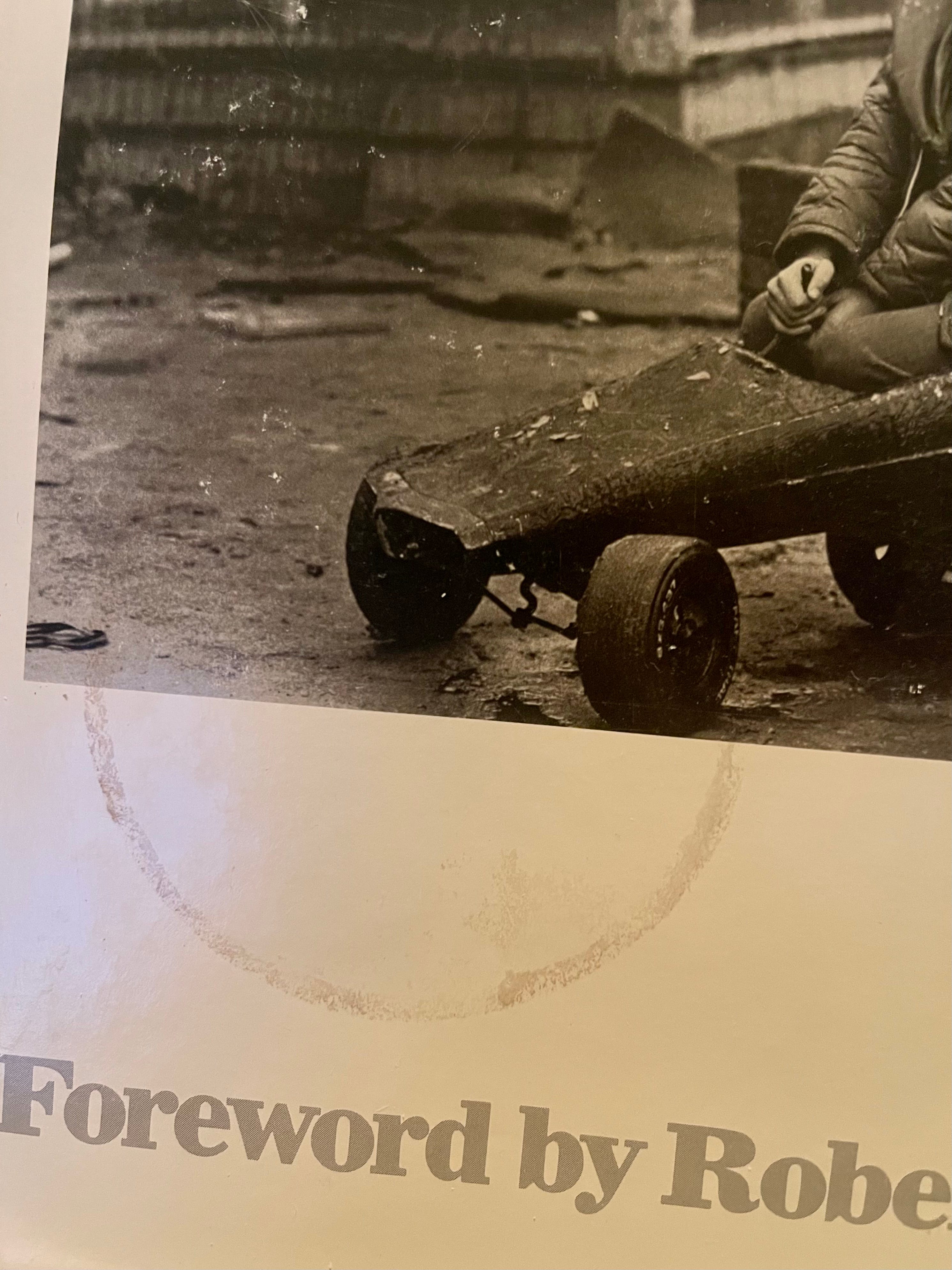
(Photo of the self-despoiled cover of my copy of the classic work by Oraien E. Catledge, “Cabbagetown”)
The coffee that spills and burns me will also stain my book if it is handy - oops - and suddenly two objects have a shared experience IRL. And as we consider the nature of ebooks, NFTs and other ‘dematerialized’ objects this “object-ness” becomes a matter of even greater interest - perhaps greater love? Somehow a different love certainly. And those of us excited about the possibilities of web3 and NFTs will want to keep that in mind early and often. And for my part this difference is exciting in both realms - vive la difference! For example, I can find and secure and spruce up a cool spot in the metaverse for sharing my digital objects with you. But, holding “Dairy Character” in my lap, feeling the weight, size, grain and heft of it is its own distinct pleasure quite apart from what it may contain inside. I can also spill coffee on it, loan it to you and never get it back etc. Just kidding - you would I’m sure eventually bring it back - coffee stain and all.

A physical book might be thought of as a vessel. Let’s make it seagoing - I like that kind. The vessel properly designed and manufactured should reflect both the voyage she’s going to make and the cargo she will haul. Thus when speaking about the “structure” of the book the aesthetic choices for the publisher, designer and artist take into account two kinds of structure: physical form on the one hand and edit, sequence and layout on the other - the disposition of the cargo. Ideally each element of the structures will support the other and harmonize.
“Dairy Character” begins and ends grounded in the practical dirt and doings of day to day life on an Australian dairy farm as experienced by a young girl and the same person coming back to it as a grown woman. It is a memory and a real time now walkabout. As an artist and writer now she returns to that place and that girl’s emotional beginnings. She approaches it all now considering it as it was felt then, and how it feels now, as if seen again for the first time. It is a very intimate and immediate first hand experience and a rumination. (To ruminate: “2 (of a ruminant - say bovine) chew the cud.”)
“Dairy Character” is an out loud - no punches pulled, personal considering of the what was, how it landed for her and those around her and what’s become of it. And in that personalized specificity it leads us to two questions: what does it mean for her now and how might it mean for us now?
(I get it - “cud chewing” is a bit over the top, but trust me, if you read her book, you’ll know Odette England will be totally into this little analogy. She will find it udderly appropriate.)
As a book object “Dairy Character” is blunt ...and elegant in its bluntness. It’s modest dimensions, smaller than copy paper - is coupled with a relative thickness. This feeling seems to be created by using a thicker than usual paper and heavy boards for the binding. The thick boards are accentuated in several ways. They are cut to the exact same size as the page block so that the boards do not extend and hangover the paper - they stop precisely with it. This creates a brick-like or practical building block feel. This is enhanced by leaving the cut raw and exposing the side of the boards. The board edges are thus not wrapped and by showing the material of the board we are confronted with the nature of the cardboard. It is unfinished and prosaic, perfect for a working dairy diary.
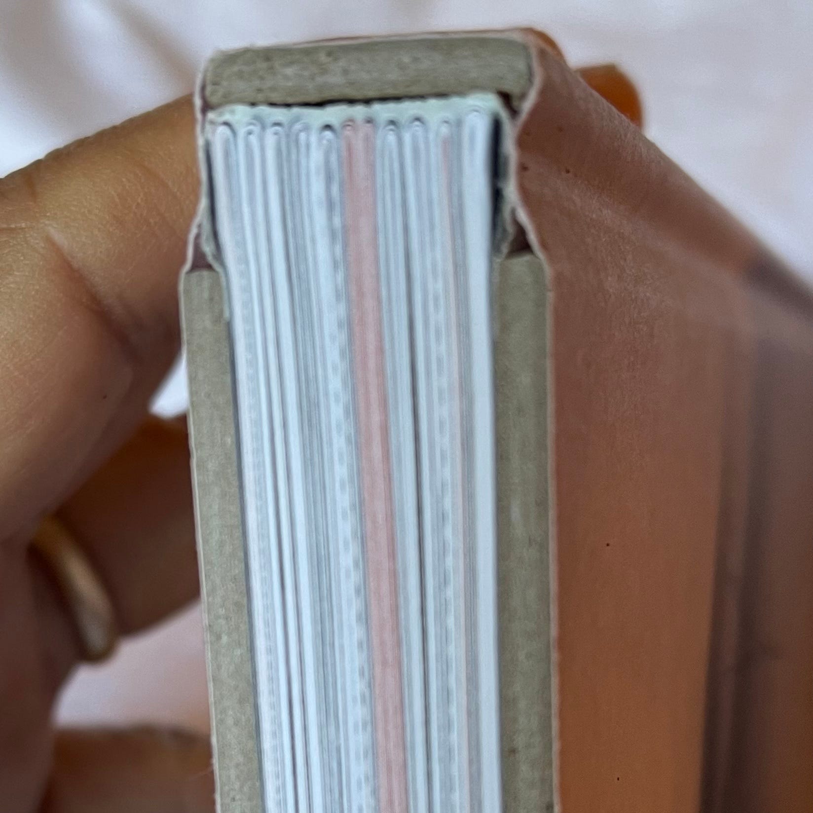
The board’s raw edge also creates a lovely warm grey color and tonal effect. The subtle neutral colors and tones of the book throughout reflect a prolonged inquiry of what it is for a girl wanting to have pink in her life, to be surrounded by biscuit and off-white tones of every nature. The nifty drabness of the boards echos those shifting monochromatic elements that are talked about and depicted throughout the book. And more importantly the matter-of-factness of seeing the raw edge of the board reminds us that after all this cover is not fancy - its just cardboard covered with printed paper. Another nice formal note is how the boards are hinged at a greater than usual distance from the spine. This creates a deeper and broader outer hinge well, this further emphasizes the sturdy look of the boards and provides the eye a nice relief from the blockiness. Taken together all these choices play into what we feel about what is going on inside.
The paper choice along with the cover and shape work hard to not be “slick”. The papers are all mat and appear to be uncoated or coated so subtly that they read mat. The overall effect of the physical shape is not unlike the “Cow Manual” that the artist’s father kept on hand. That manual is a touchstone at key points in the book. And it provides some of the powerful vernacular images and is an aesthetic inspiration for aspects of the design of the physical form of the book. So important elements of the physical structure of the book pull from and support the destination of the vessel back to the time of the young girl’s life on a dairy farm and it supports beautifully the voyage we are undertaking with her now all grown up.
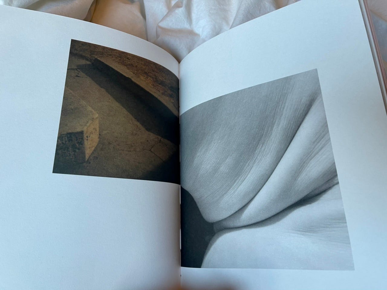
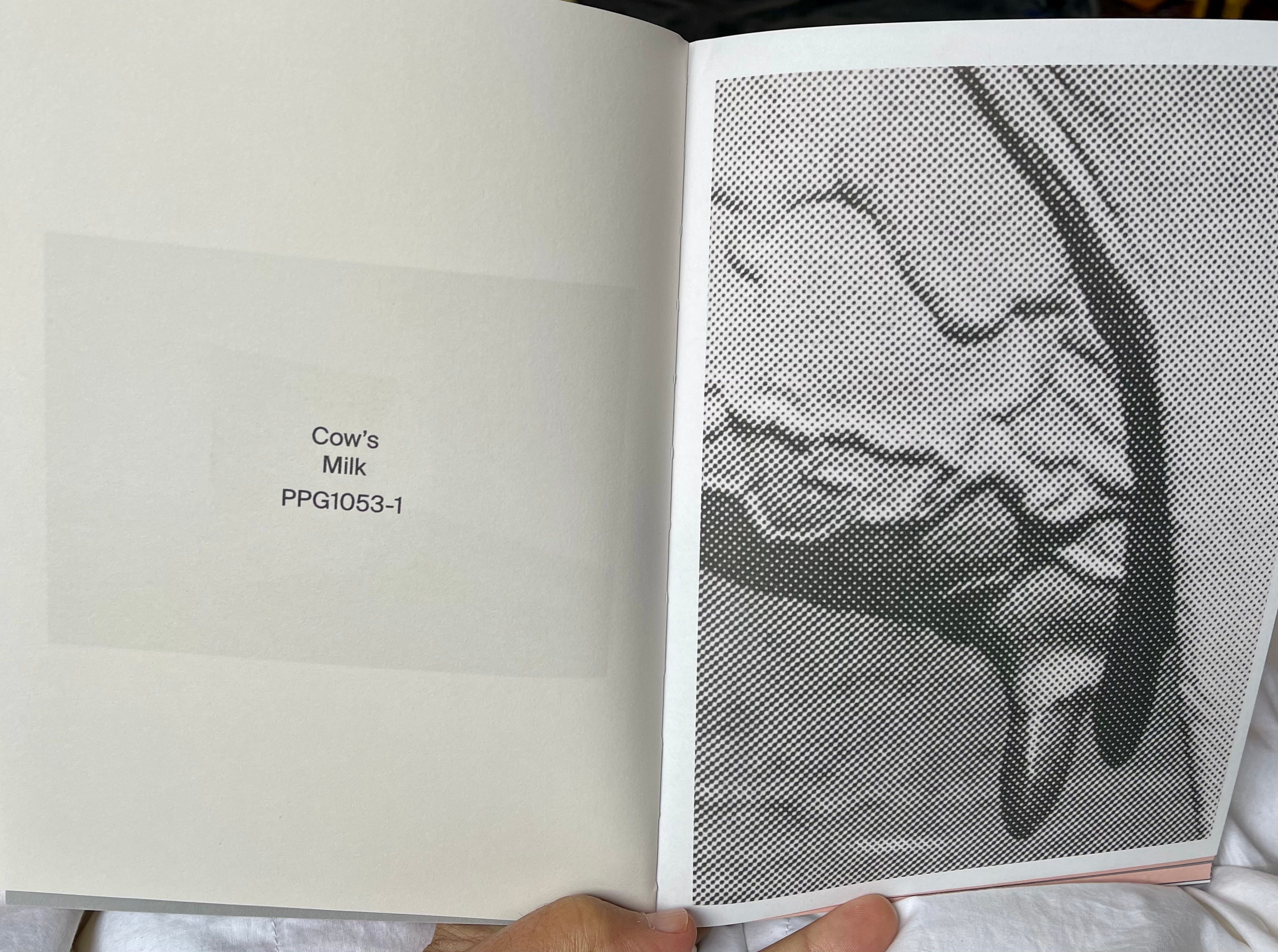
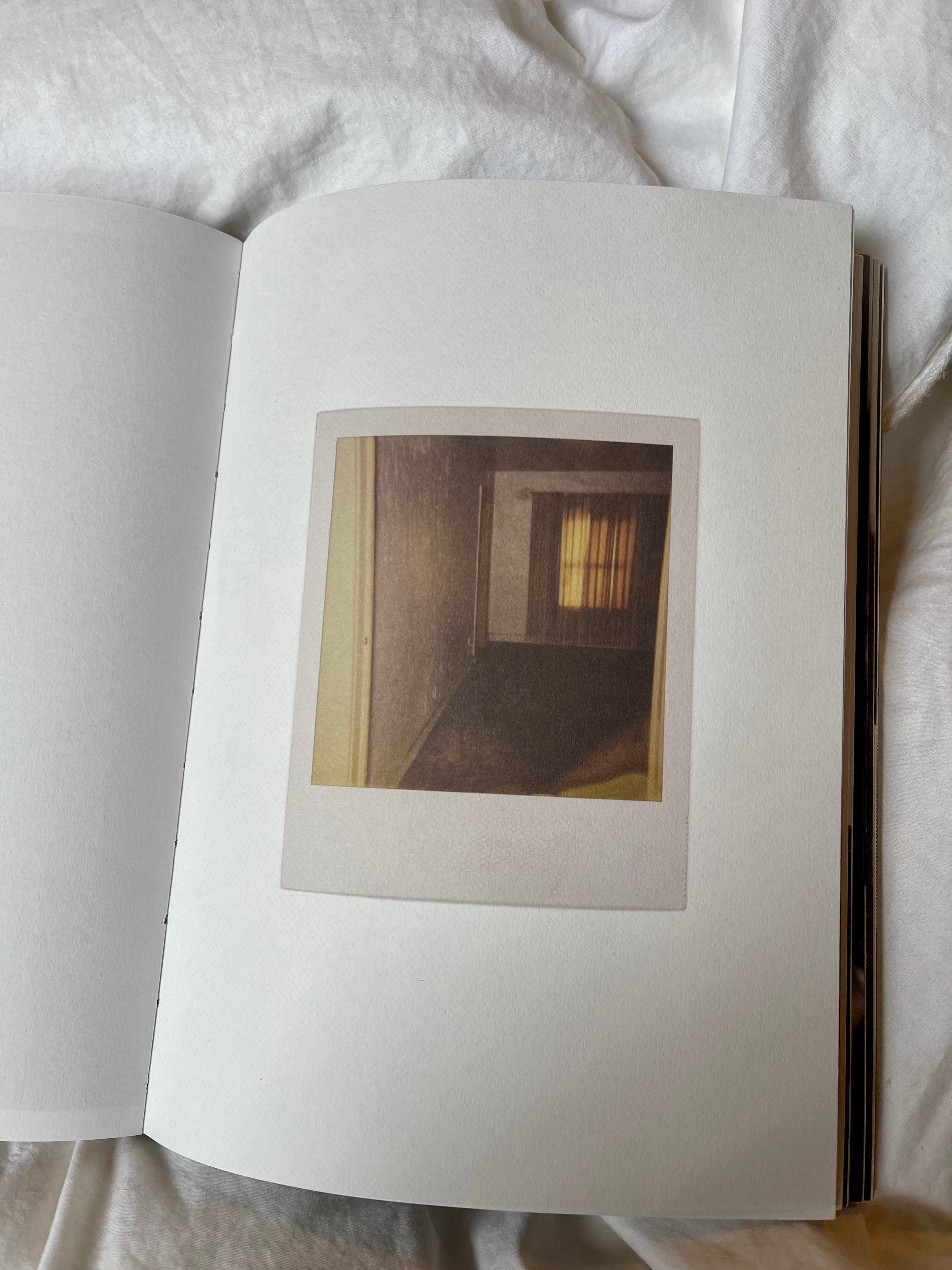
The edit, layout and design of the contents of the book are even more complex and ultimately rewarding. The key choices reflect the artists fluency in image work in words, pictures, graphics, colors, tones, and placement on page. The range of pictures as I’ve written about at length in Part One of this essay run the gamut from snapshots to cow manual imagery to Polaroid to fine landscape photography. The words flow from mini-essays, sweet letters of reminiscences from her mother, to poems and paint-chip labels. What is remarkable is that all of this is orchestrated to such powerful and careful effect. In Zen painting it is thought that the toughest job is to paint four small dots on a sheet of paper perfectly, so that it doesn’t feel contrived, nor does it feel accidental - it feels inevitable. That is the challenge that the artist, designer and the “Dairy Character” team have achieved with this book. The layouts range from full bleed to half-page top, bottom, corner - frankly you don’t know what to expect although you usually (that’s a great feeling) sense or figure out what is being pointed to or more often mused about as the layout unfolds. For example this is a photograph of a bare bulb for a porch light (perhaps the very one) she is describing in an opening written passage. It serves in her writing as an important symbol and an elemental memory of very early childhood lying awake in bed as moths dance around it before she falls asleep. Here we see it now as she comes upon it a grown-up. Mystery and romance gone - but she still looks up to find it. And we recline there with her - looking up - wondering at the romance we too have lost along the way. Placed up here and across the gutter at the top of the spread it is as if we too are lying in bed looking up and out a child’s window at it.
My last word on the book’s design is simply that the book’s creators had the good sense to leave the book open to interpretation in every respect. The love of the journey that the artist was on as a girl and that she returns to is everywhere suggested and no where stated. Likewise the pain, and pangs of growing up - suffering and knowing that those they love are suffering too as they absorb and unwittingly deal suffering in their turn as every human life must do. How all of this can be bound up in a book about a girl finding what is the ‘cow-ness’ of the life she’s given and what is the ‘girl-ness’ of the cows that surround her makes for an extraordinary reading experience. Every image, each word - in service of something that is implied and not imposed. And above all is a love of the raw experience of being - being unflinchingly, just this.
(Unless otherwise noted all images presented here are of or from Odette England’s book “Dairy Character” - they’re taken by me #readingphotobooksinbed!)
PS I will speak about the choice of cover image in the next essay about the essential nature of the book’s content. A book’s cover is certainly one of central structural design elements of a book - but in this case the cover choice is so thoroughly echoed throughout the content that I’ll discuss it there.
To borrow from James Joyce: “Yes, yes, yes…”